Me and the artist exchanged ideas about the video via text message as well as arranging days where we could meet up. We also decided the clothing she should wear so that I could get an effect of her being a naked silhouette; which connotes her being exposed and un-hidden from the world.
I used my phone to screenshot these texts to turn them into images. I then downloaded the Blogger app from the App Store so I could easily upload these images from my phone.
A problem I had with this would be that my artist wouldn't always receive my messages and would be late for filming sessions.
The Camera I used- Canon 600D
My video was edited to be in slow motion, up to 100% slower. So the settings I used in terms of frames rates were 50 frames per second. This means the camera samples still images at a much faster rate to create a more smooth flowing video, so when the image is slowed down, it doesn't jump from frame to frame. generally, the conventional camera settings used in a filming situation, whether it be a music video or a film, are 24 frames per second (typical Hollywood film settings) or 25 frames per second (typically used in Europe). The reason these frame rates are used so much is because the human eye sees things at these frame rates. if the frame rates were as high as 500 fps and shot in normal time, the video would look slightly strange as the human eye isn't used to seeing that many frames in real life.
18-55 mm lens
I used this lens for the majority of the shooting because of the stabilization of the video because of the low zoom. this meant that the shots were steady, even when the camera was hand held. also, its easy to keep in focus because of the shallowness of the lens, however the depth of field isn't as pronounced. A disadvantage to this is that you have to hold the camera very close to the thing you're filming.
55-200 mm lens
I used this lens for shots such as filming the burning pile of leaves. this is because of the depth of field it creates as well as being able to film it from far away, which helped prevent the camera from getting burnt. A disadvantage of this lens is that it goes out of focus easily when the camera is moved. Also, its sensitive to movement so filming can look shaken when the camera is handheld; however when using a tripod this is greatly reduced.
I used websites such as http://www.bbc.co.uk/weather to check the weather for the days I arranged to film. I did this because I wanted the weather to be as bright as possible because I was using a high frame rate on my camera, which reduces the exposure. A problem with this was that the weather wasn't always accurate and some days where slightly more cloudy and less bright than others. However, this enabled my to get some good effects by the use of brightening the clips post production to create eery effects such as this one.
"I think your video is amazing, the range of locations appears very professional as they are unique which I usually see with existing music videos. Also the use of cinematography really keeps me enthralled to the video as it is not repetitive and there is a variety which highlights the abstract nature of the video. I think the use of effects you've added and how you have manipulated the footage in post production creates fluency and matches the style and genre, creating cohesion to the song and video. I cannot criticize anything."
In relation to the audience feedback, the use of a variety of shots with only a couple of shots being repeated in my video was a positive point because of the ability to keep the audience interested through constant anticipation. as well as the vast use of cinematography covering a wide range of framing and angles, such as cantered angles and low and high angles.
I have learned not to listen to everyone's views regarding the video and digipak because of the fact that everybody has different preferences. However, technical things such as "I think you should slow down the edits from 2.15 to 2.35 because they don't fit with the audio", would probably be noticed by a large number of audience members so instead of leaving it as it is, I altered it to match the person's preferences.
In my opinion, younger people would give more qualitative data because of the fact that my target audience is from 16-25 year olds. Furthermore, for my audience feedback I asked a wide range of people but if I was to carry out this data collection again, I'd ask a few people that I didn't know. This is so I don't get a biased answer and so they don't feel as if they're offending me if they're critiquing the video. Furthermore, the general theme I observed through the data collection was that people were saying things such as "I can't criticize anything because there's nothing I'd change about it" and "I think it's amazing, it couldn't be any better". This didn't help the process of finding out how I could improve my video for my audience.
For the reasons above, I decided to ask a new group of people who I knew would give me an honest answer. These consisted of a people who I knew personally but who I wasn't friends with. These people gave me more qualitative data such as "I didn't really connect with the narrative because it was a bit too depressing and dark. I understood what you was trying to do but I think it was too much". Although I made my video to be intentionally sad and dark this may not connect with everyone.
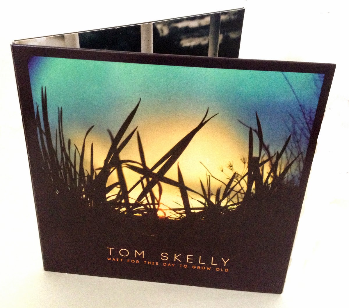
In my opinion, the ancillary text matches the mood and the genre of the video and is a good representation of the artist as a whole. Features of this include the text; which I decided to keep as simple and as minimalistic as possible. The use of space between the letters in the titles creates a gothic effect and is used in other media texts such as this Album by Tom Skelly called "Wait for this day to grow old."
The genre of Tom Skelly's music is very similar to the genre of my artist. So I took inspiration from the front image through his use of under exposure, making the image appear darker then what it would be naturally. This is done after post production by the use of photoshop, and using the exposure tool.
Here is an example of his music
This song is slow and melancholic, similar to the song used in my video, so I thought it was an appropriate digipak example to get inspiration from. I thought this was effective because it matches forms and conventions of real media products and shows a clear representation of the artist before even listening to the music.
Using my audience feedback shown in the following paragraph, I can use second hand input to gauge the success of my products as a whole. This is an extract of feedback for my video:
"I like the dark setting, it represents her mood and her life in sadness. the matches show glimmers of happiness and hope but they are always blown out. I like the close up of both the sets of eyes, it shows emotion and the video shows her life counting down the days to see her bae (her lover) which you can tell by the tallies on the tree and the end setting of her running into his arms.
It makes me feel sad and sorry for her, But happy at the end. Just a bit of a roller coaster really"
This explains that this audience member understood the sub-narrative which I showed through abstract themes. For me, this was one of my goals when making the video, as well as making the video an "emotional rollercoaster", meaning that there's a bit of confusion regarding the artist's mental health, as well as having hope when she runs out of the sea towards the man, for the clip to cut to a shot of her walking into the sea again. I wanted to confuse the audience slightly and make them feel empathetic towards the artist so that at the end, when she walks back into the sea, the audience would feel sad because of the denotation of her committing suicide and not being able to cope. I think this is effective because the majority of people, including my target audience, have been through times in their life where they feel like they can't cope with life circumstances. possibly not to the extent of the sub-narrative in my video, but maybe something similar.
"I think your video is amazing, the range of locations appears very professional as they are unique which I usually see with existing music videos. Also the use of cinematography really keeps me enthralled to the video as it is not repetitive and there is a variety which highlights the abstract nature of the video. I think the use of effects you've added and how you have manipulated the footage in post production creates fluency and matches the style and genre, creating cohesion to the song and video. I cannot criticize anything."
Mark Wardropper- 50
"I like the clever use of light, especially the recurring use of the flame, which holds the piece together. The flame to me represents the delicacy of where she is, it could ignite or it could be extinguished. The same applies to the use of the flowers, the dead ones representing the negativity, but the ones in bloom offering hope. The sea scene at the end is quite disturbing, suggesting a suicide walk. I was pleased when she walked out to a welcoming towel, but the final scenes have her going back in again. So at the end I was confused. Did she sort herself out or did the demons win? Maybe that was the angle you were searching for, but being a control freak I like a definitive ending! Overall a very haunting video which blends well with the soundtrack."
Georgia Saunt- 18
"I like the dark setting, it represents her mood and her life in sadness. the matches show glimmers of happiness and hope but they are always blown out. I like the close up of both the sets of eyes, it shows emotion and the video shows her life counting down the days to see her bae (her lover) which you can tell by the tallys on the tree and the end setting of her running into his arms.
It makes me feel sad and sorry for her,
But happy at the end. Just a bit of a roller coaster really"
Izzy Smart- 17
"Really good mixture of angles, the narrative is easy to follow, good how things are on beat and the slow motion really goes with the mood of the song and there's good graphic matches with the lyrics"
Dan Conman- 28
I liked the feel of the video and I thought the video matched the audio. The only thing I'd say is that I think you should slow down the edits from 2.15 to 2.35 because they don'f fit with the audio. Other then that I think the video is spot on
I think an important aspect of my video which coincides with other media products is the use of connotations and reoccurring themes within the mise-en-scene. In this video, B a noBody by SOAK, there is a reoccurring theme of round balloons in various places, usually high in the sky. This may connote a person's disposition within society which doesn't fit and appears strange. This suggestion also coincides with the title of the song, "B a noBody".
Furthermore, my video expresses connotations in a similar way, in that the use of fire is used to represent destruction as well as water to represent death and drowning, which are two reoccurring themes within my video (the shots below show this)
Within the editing features of this video, there are cuts on the beat of the music which is a feature present is my video, as well as cuts on the beat of the lyrics. Furthermore the use of effects are similar because the majority of the colour has been stripped from this video to create a duller, more melancholic mood.
Another feature which is similar is the range of cinematography used to draw emphasis on certain subjects. An example of this, in the video above, is the shot where the girl opens the drawer where there is a close up of the photographs in the drawer. Also, the long shot of the balloon with a town in the background, the balloon being the subject and the town being in the background.
Another similarity is the use of slow motion. However, in the video above, the slow motion for the most part is very subtle. The purpose of this, in my opinion, is to coincide with the speed of the song. This is a feature which I used because I wanted to express a slowness in the artist's reality, and to suggest that she doesn't have any purpose in life and that she's living in a reality without progression.
I think this is a good way of engaging an audience because it makes the audience empathize for the artists: because most people, including the audience, have probably experienced a feeling of lacking purpose and direction at some point in their lives.
A feature of which challenges conventions is my use of effects in my video. The effects used further perpetuates an ideology of a morphed reality. This is through the use of colour, exposure and emphasizing light within shots. The most extreme example I have of this is the shot of the gratified wall. (pictured below) I got this effect by using the "keyer" effect as well as the "luma key" effect. these effects bring down the exposure of shots and make the screen almost purely black. after applying these effects I used many layers of the "glow" effect which makes any light in the shot glow. I achieved this effect through trial and error and I haven't seen an effect in a music video which looks anything similar to what I created.
Another effect I used which I haven't seen in any other commercial videos was the use of the "keyer" effect to make a persons eyes look extremely dark. (such as the image below) I achieved this effect because the sun was more or less directly above the artist. This meant that the light from the sun did not reach her eyes because there was a shadow from her brow. This enabled me to bring down the exposure of shadows creating an effect which makes her eyes appear to be completely black. This effect is apparent when you look at the shadows under her bottom lip and under her nose: the shadows are exaggerated so they look darker.
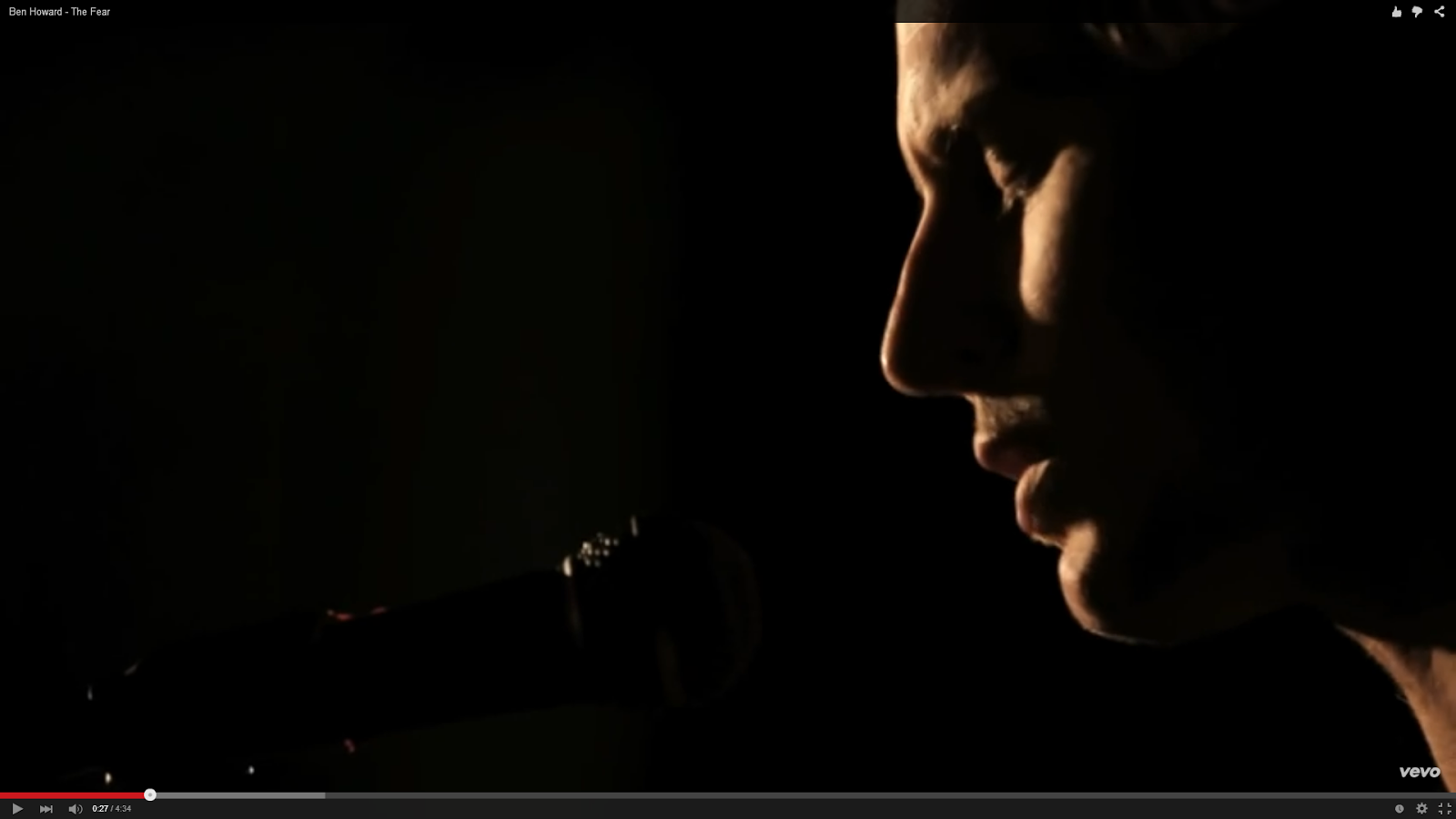
The use of shadows also created a good effect in the skin, giving it a lot of texture and separating the light shades from the dark. This effect was also used in Ben Howard's music video, "The Fear", however, in Ben Howard's video, the effect was used more naturally along with artificial lighting.
I used examples such as the effects and lighting used in Ben Howard's video to develop the effect I used to make my shots match the mood of the song.
A feature of which I chose to neglect in my video was the use of lip syncing. This is because I thought lip syncing would spoil the mood of my video and give it more poppy, mainstream, and possibly light-hearted feel. I wanted my video to feel as moody and as eerie as possible. Also, I though the absence of lip syncing made my artist seem more mysterious, as well as making the audience consider the meanings behind the imagery more without being distracted by the artist lip syncing.
Another reason for not using lip syncing was that I think it's extremely easy for it to go wrong because of the fact my video was in slow motion. This meant that there would have been a greater risk for the audio to be out of sync with the clips. when bringing the clips to post-production.
An aspect of real media videos which coincided with my video was the use of shots where my artist looks directly into the camera at a medium close up/close up. There are multiple videos in the industry which use this shot. Here are some examples
Keaton Henson- Sweetheart, what have you done to us
Soak- BLUD
Matt Corby- Letters
The image below is a still shot from Keaton Henson's music video, Healah.
An aspect of this shot I took as inspiration for my video was the
portrayal of suggestion by the use of blurring subjects. The man in the
white shirt is a significant part to the video however he is blurred.
this creates anticipation for the viewer. I used this technique in my
video by creating Imagery such as the still shot below. Instead of
blurring the subject I used effects to alter colour, brightness and
contrast, as well as turning the middle of the shot into a fish eye
effect. This meant that the viewer's perception of reality is warped
into what I want them to see, similarly, in Keaton Henson's video, the
reality of the shot is warped into what the director wants the viewer to
see.
To amplify this, the use of reflection from the water further signified the ideology that what is visual is not always reality.
In reference to Laura Mulvey's "Male Gaze" theory: my video challenges conventions of this aspect through the lack of direct sexualisation of my artist. However, there are aspects which suggest that my artist is sexualised by the use of the close up shots of the lips and the blowing out of the candles whilst she keeps full eye contact with the camera. I decided that directly sexualising my artist through the use of provocative clothing wouldn't have been necessary because of the fact males aren't my specific target audience. Also because of the fact that I wanted the focus to be on the imagery and what the connotations behind the shots were rather than the artists sexual features. However, I had an idea of my artist as a naked silhouette walking into the ocean to signify vulnerability and naivety. In explanation to this I was going to have her wear skin tight clothing whilst reducing the exposure on my camera whilst having the sun in the shot behind her so that she'd appear to be a naked silhouette. However, I decided this wasn't necessary because I could express the same connotation whilst she's wearing a dress and keeping the effects the same. This would also prevent the connotation being misinterpreted by an audience member. An example of a video that is very sexualised would be Nicki Minaj's video, Anaconda


